Welcome to Sakyoto - a Japanese-themed restaurant brand I created for my Fall 2024 Branding class. This project was designed to immerse diners in the rich culture and timeless traditions of Japan, blending elegant visuals with thoughtful branding to create an authentic and memorable experience.
Inspirations

My inspiration for creating this brand came from my long-standing desire to visit Japan. Ever since I was young, I’ve dreamed of going, but international travel was always out of reach due to the cost. Despite that, I’ve explored Japan through photos and videos, captivated by its vibrant culture, everyday life, and deep respect for tradition. It’s a country that beautifully balances modern innovation with centuries-old customs, and that spirit inspired the heart of this project.
Logo

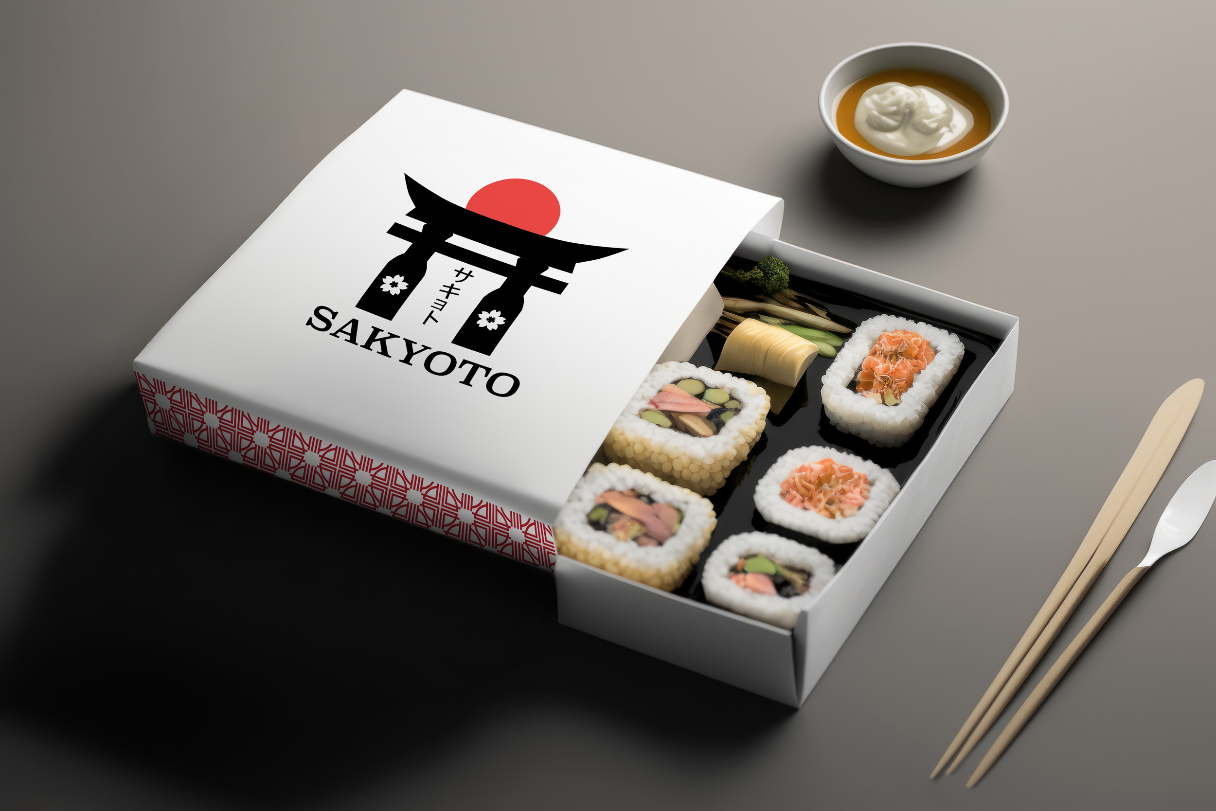
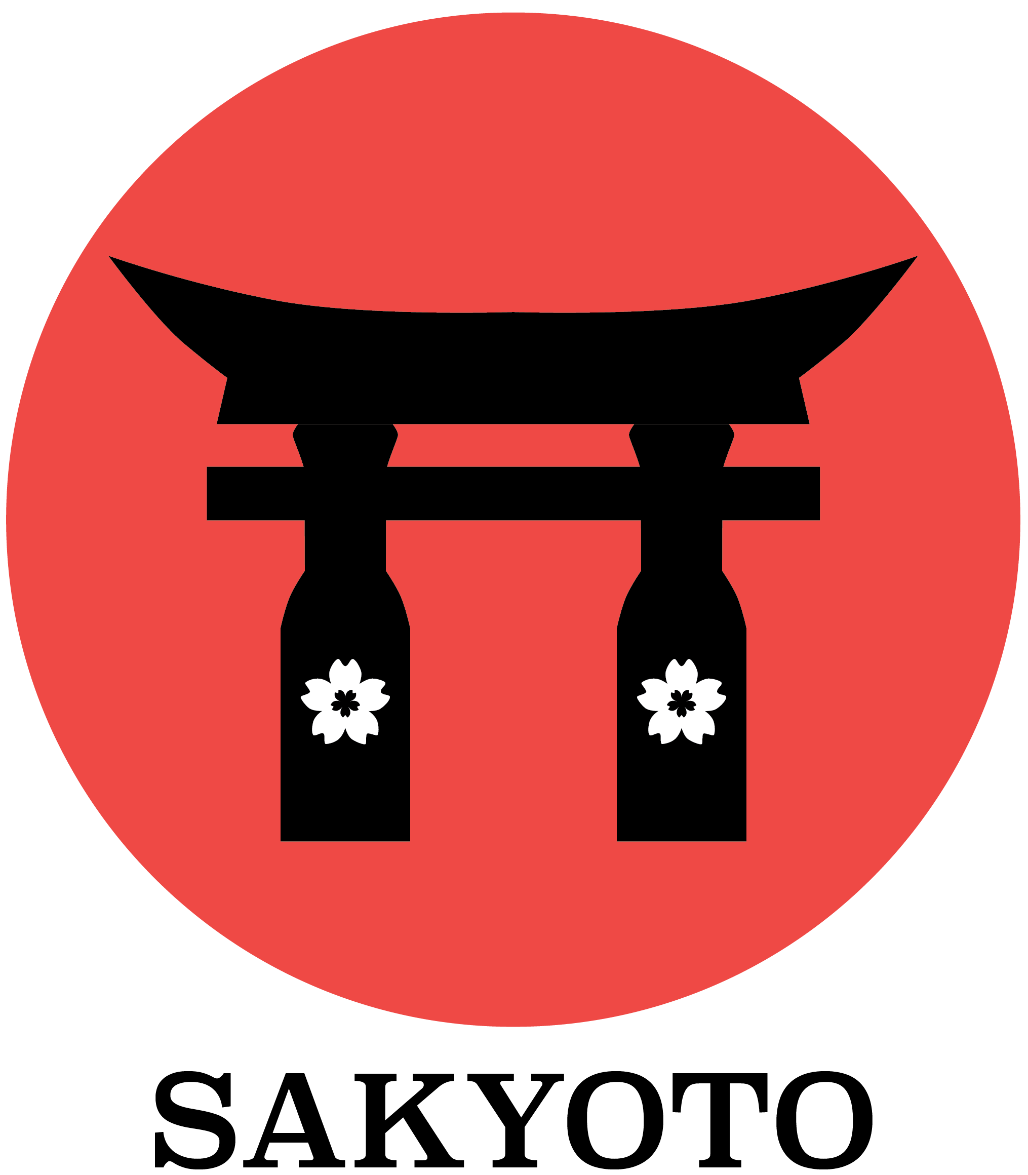
The name Sakyoto is a blend of two Japanese words—Sakura, symbolizing cherry blossoms, and Kyoto, a city known for its rich cultural heritage. For the logo, I explored multiple concepts before finalizing a design that features a stylized torii gate with a red circle, representing the Japanese flag. The gate is depicted as a bold silhouette, supported by two sake bottles used as pillars, each adorned with a sakura flower symbol. One version of the logo also includes the kanji characters for Sakyoto, adding an authentic cultural touch.

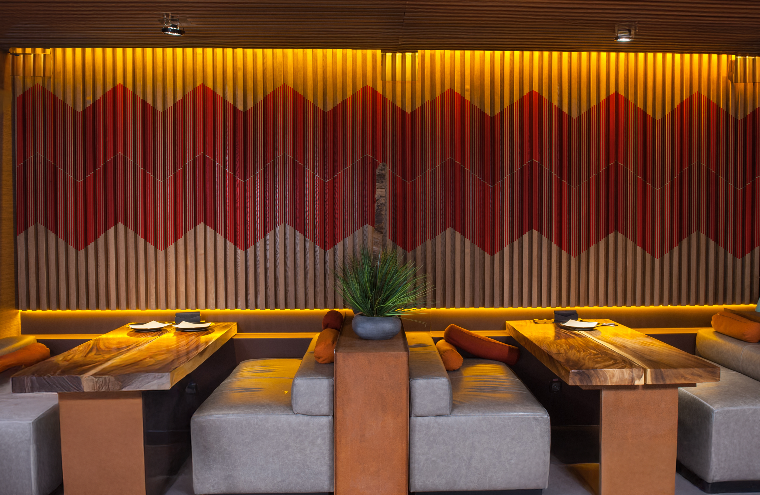
Patterns


My pattern designs are inspired by traditional Japanese motifs. I put significant effort into crafting patterns that closely reflect the aesthetics found in Japanese culture. The design on the left was my initial concept and was used frequently early on. However, I eventually transitioned to the second pattern, as it felt more aligned with the visual style and cultural elements typical of Japanese—and even some Chinese—design traditions.

Before developing the Sakyoto brand, I created a style tile to establish the visual direction, including color palette, typography, and pattern designs. For the color scheme, I chose two distinct shades of red to incorporate into the patterns, a dark gray as the background for deliverables, and black as the primary color for the logo.
I selected three fonts based on personal preference and visual harmony. Superclarendon was used for the brand name on the cover, while Kefa was chosen for the menu text to ensure readability and style consistency.
The images showcase the key pattern designs featured in the project. The sakura symbol was integrated into the logo, while the remaining three patterns were developed to complement the brand’s overall aesthetic and cultural theme.